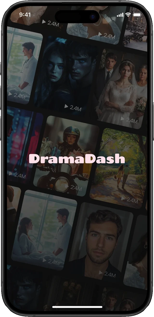
DramaDash
A short drama streaming app for iOS and Android. The MVP was designed in six days, the app was live on day 21, and it holds a 4.8 App Store rating.

About Project
Short drama apps have grown into a global phenomenon, generating significant revenue and capturing millions of users worldwide. With players like ReelShort and DramaBox already established in the space, the brief was clear: build a competitive short drama streaming platform, fast.
My Role
End-to-end product design: discovery and user flows through to high-fidelity UI and a design system built to scale. Working in close collaboration with the Project Manager, I kept the process lean enough to hold a six-day deadline.
01
The challenge
A narrow window to validate the concept, and no room for a traditional design cycle.
Speed was the brief
The market was moving quickly and the window to validate the concept was narrow. There was no room for months of traditional design cycles. The goal was to move from zero to a fully functional, market-ready product in record time.
That changes what counts as a design decision. Every screen had to be worth the hours it cost, which meant leaning on patterns this audience already knew rather than inventing around them.

02
What we did
Four decisions carried the deadline.
MVP designed in 6 days
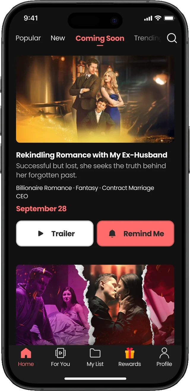
All core flows of the application: content discovery, drama detail pages, the episode viewing experience, user profile and the subscription flow. Every decision was made with speed and clarity in mind, adopting familiar industry patterns to reduce friction and accelerate development.
AI-assisted foundation
AI-assisted workflows carried both the design exploration and the build of the design system, particularly decisions around colour palette, typography and foundational visual language. That reached solid decisions faster and let me spend the time where it mattered: the product experience itself.
Live on day 21
From completed design to live app the entire process took 21 days. iOS and Android launched simultaneously.
Platform-native experience
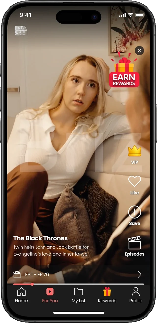
We built around the habits users already have in this genre: vertical video, episode-based progression and fast-tap navigation. The goal was a familiar but polished experience that felt native from the first session.
Screens
The core flows, from first launch to the token economy that pays for the next episode.
Getting in
Splash and sign-in. Two taps and a reader is watching.

Discover
Home, what is coming, and what everyone else is watching.

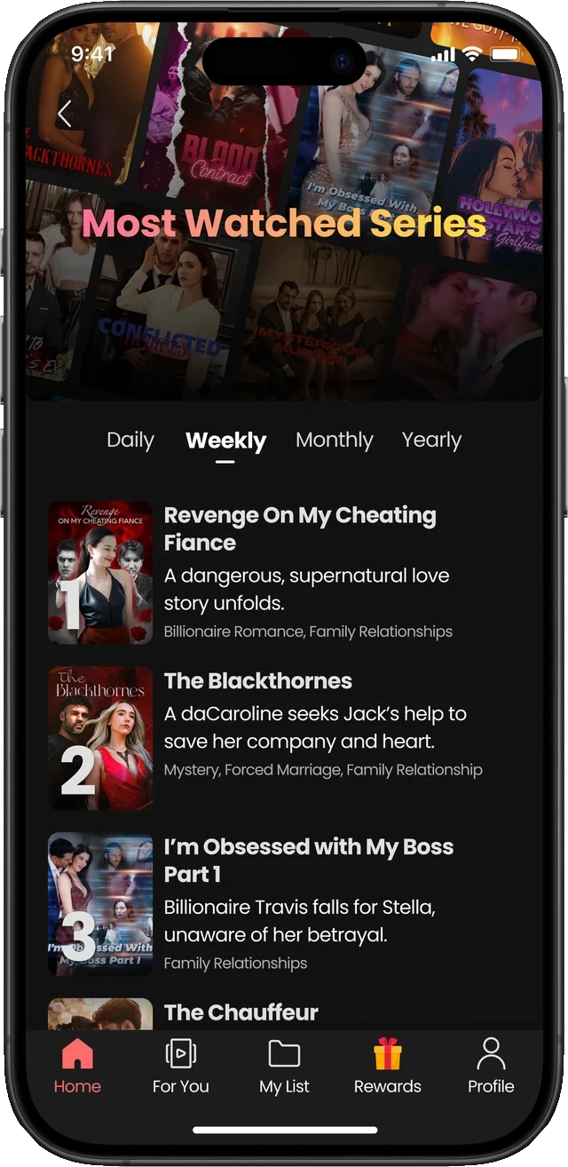
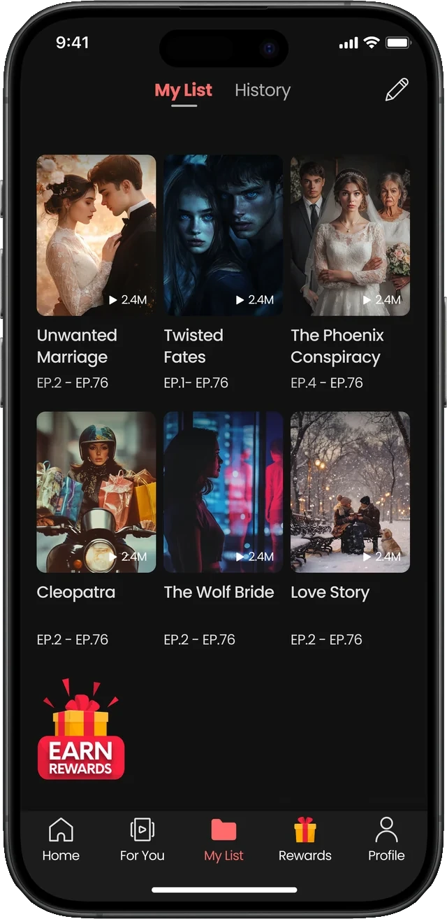
Watching and the library
The vertical player, and the titles a viewer comes back to.
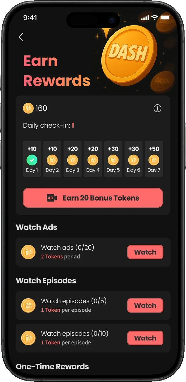
Rewards and account
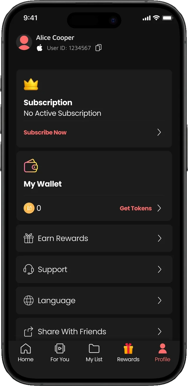
Where DASH tokens are earned, and where the subscription and wallet live.
Illustration
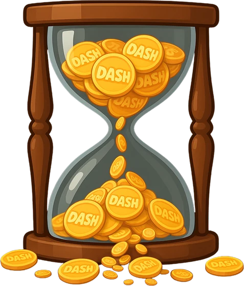
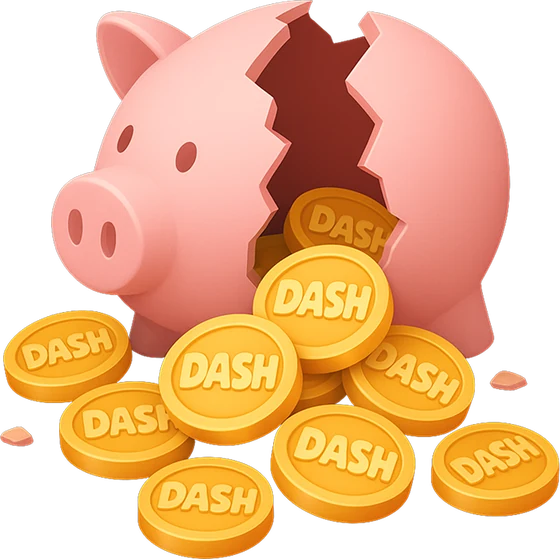
The token economy needed a cast of its own: something to earn, something to keep it in, something that runs out. The set was produced with AI tooling, which is what made a full illustration library possible inside the same six days as the screens.


The home screen, end to end
Everything a viewer scrolls past on the way down: the featured carousel, new titles, the most-watched rail, and four more rows of genre. Scroll inside the phone.

Scroll inside the screen
03
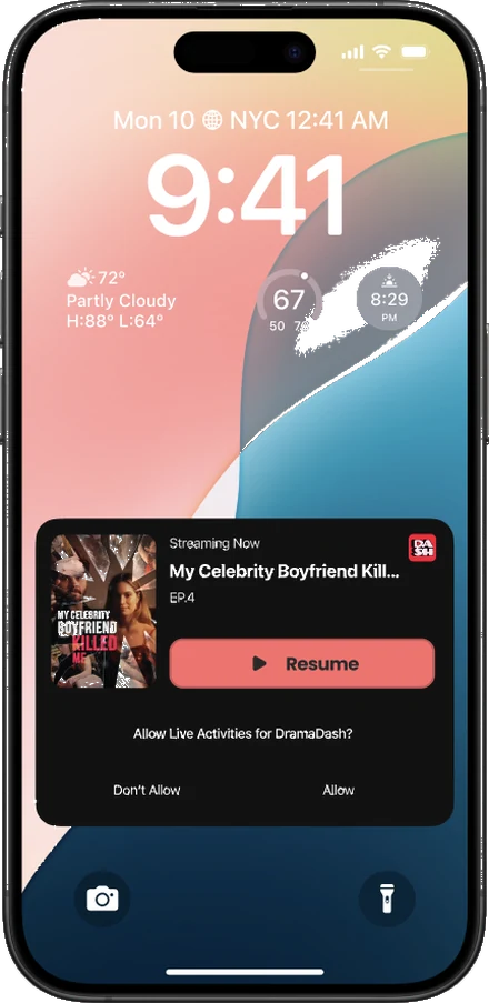
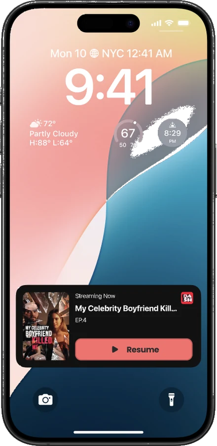
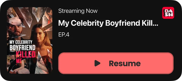
Live Activities
The app keeps working on the lock screen, so a viewer never has to open it to find their place again.



Outcome
DramaDash launched on both iOS and Android in a record 21 days, later expanded into multiple languages, and holds a 4.8 rating on the App Store. The project proved that with the right prioritisation, smart use of modern tools and a focused design process, it is possible to bring a competitive product to market in a fraction of the conventional timeline.
DramaDash is a VLMedia Inc. product. Screens, artwork and brand assets © VLMedia Inc. All rights reserved, shown here as a record of my design work.
All projects