Novelty
A reading and audiobook app for iPhone and iPad. The research, the reference scan, the typography trials, the flow chart and the colour work the MVP was built from, and the screens they led to.
About Project
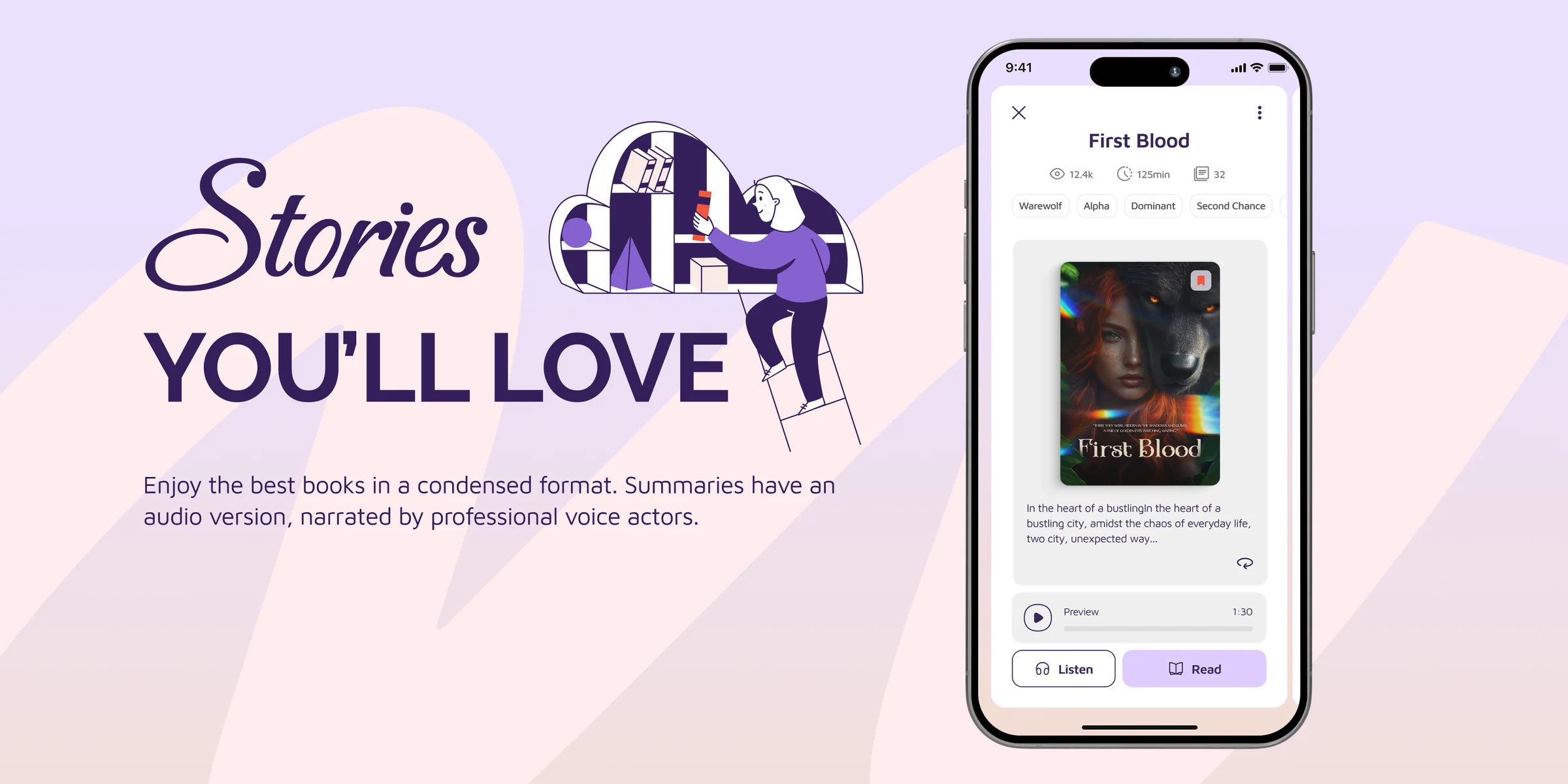
Novelty is a platform for reading and listening to fiction on your phone. Readers browse by genre and popularity, sample part of a title for free and unlock the rest, follow what they are reading and save titles for later. The brief was an iOS MVP, later adapted for iPad, so deciding what to leave out mattered as much as deciding what to build.
My Role
I ran the discovery phase and mapped the product before any interface work began, audience and competitor research, screen-by-screen product notes, typography trials, and the full flow chart. That groundwork, and the screens it led to, are both on this page.
Phase 01
Research
Who is this for, what already exists, and where is the room to be different.
Where we started
The target audience skews strongly female and spans a wide age range, which ruled out a young-skewing visual language early on. Reading is the core activity, so the interface had to get out of the way rather than perform.
What the MVP had to carry
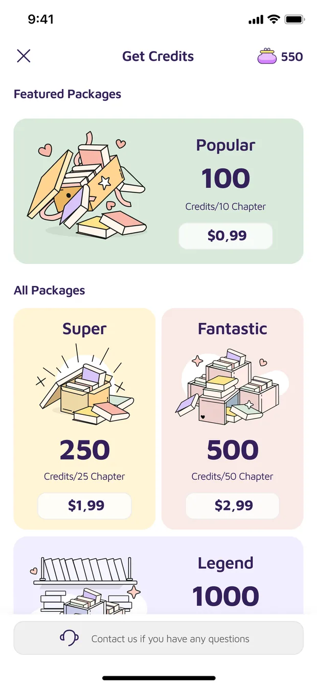
- Ten per cent of every title free. The rest unlocks with in-app credits, sold by the chapter or by the whole book.
- Part of the catalogue narrated, with a place of its own in the navigation.
- Dark mode designed alongside the light theme rather than bolted on afterwards.
- Type size and typeface left to the reader in the reading view.
- Four ways in: Apple, Google, e-mail, or continue as a guest. Nothing is asked for before the reader has seen the product, and the genre pick at first launch can be skipped.
- Notifications for new titles, visible reading progress, and a shelf for things saved to read later.
- English-only catalogue at launch, with language selection planned for later.
Audience & competitive analysis
Define the audience and their needs. Run a competitive analysis and study the UI/UX patterns of comparable apps.
Key features & user flows
Identify the key features, design the experience flows, and build a general road map for the interface.
Core interface designs
Produce the primary screens, home, content list, content detail, at a basic level, with simplicity and function leading.
Visual system
Set the colour palette and theme, with dark mode considered from the start. Select typography, then detail the icons, buttons and menus.
Reference scan
Nine reading apps pulled apart screen by screen, discover, book detail, reading view and library captured separately for each. Three more were referenced for single patterns rather than taken apart in full.
The shortlist was not picked by taste. It came from the top five charts in five markets, the United States, Canada, Mexico, Brazil and Argentina, tracked on Apptweak across a month, 22 February to 22 March.
Also referenced
Product notes, screen by screen
Rather than jumping to layouts, I wrote what each screen owes the reader. Those notes became the acceptance criteria for the wireframes and settled most scope arguments before they started.
Discover
Browse the catalogue and search it by theme, title, author, tag or language. Split into theme, popularity and new releases, with room to become tabbed once the themes multiply. Save for later without opening the detail page.
Search results
What a query returns. Straight into book detail from any row, or favourite it from the list.
Book detail
Summary, opening extract, theme, rating and reviews. Buy, start reading, add to the library or to favourites, share, report.
Reading view
As close to reading a book as a screen allows. Notes and bookmarks, chapter navigation, jump to any page, return to a bookmark, buy the next locked chapter without leaving.
Profile
Settings, credits, favourites, purchased books and reading history.
Credits
Where coins are bought, and where support is reached from the same screen.
Phase 02
Choosing a reading typeface
In an app where people read for an hour at a time, the typeface is the product.
- Literatareading option
- Garamond
- Georgia
- Playfair
- Inria
- Merriweather
- Ovo
- Maven Proapp-wide
- Georama
- Montserrat
- Museoreading option
Tested in place, not in a specimen
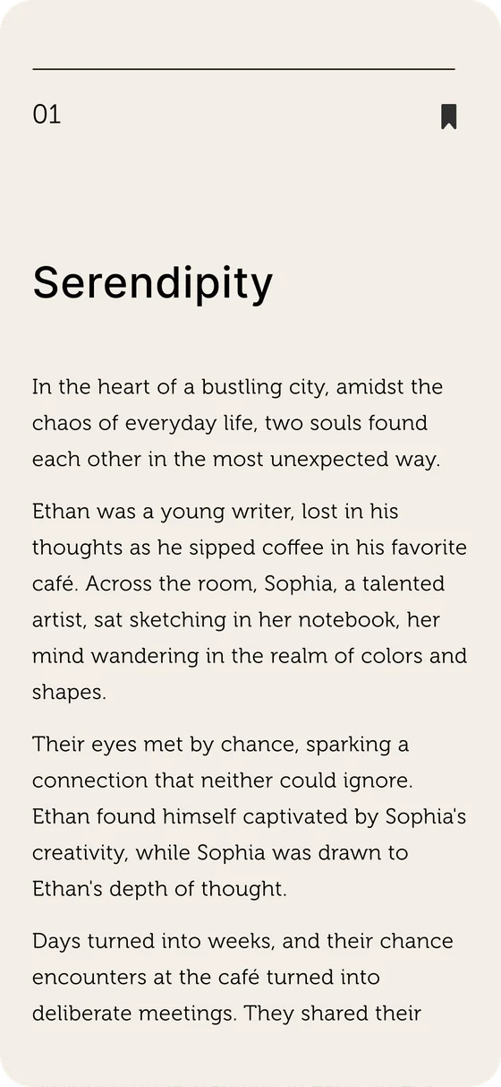
Every candidate was set into a real reading page with a full short story rather than a line of sample text, the same paragraph, the same measure, the same line height. A typeface that looks characterful in a specimen can turn tiring across a chapter, and that only shows up at length.
One for the app, three for the page
Maven Pro runs the whole app: navigation, buttons, cards, empty states. In the reading view it stays available, but it is not the only option. A serif is easier on the eye over an hour of reading, so the reader picks from three rather than living with one person’s taste.


The alphabet
Maven Pro, set out in full. Square dots on the i and j, angled terminals, circular bowls, geometric enough to hold a button, open enough to hold a paragraph.
Phase 03
App flow chart
iOS · MVP · v1.0, organised in four bands, from first launch down to the deepest sub-screen.
Simplified from the working chart, roughly 100 screens and states in the original.
Phase 04
Colour and empty states
A palette the app can be recognised by, and drawings for the nine screens where there is nothing to show.
Colour direction
One purple carries the brand and everything else stays out of its way. The primary sits on buttons, the active tab and anything the reader is meant to press; the deep purple-black under it does all the text. Five pale tints handle the surfaces behind content, and two gradients are reserved for banners. A catalogue of covers needs an interface that can sit beside them without competing, so the supporting set never goes above a tint.
Core
Tertiary: surfaces, chips and empty states
Gradients: banners
Off-white, not white
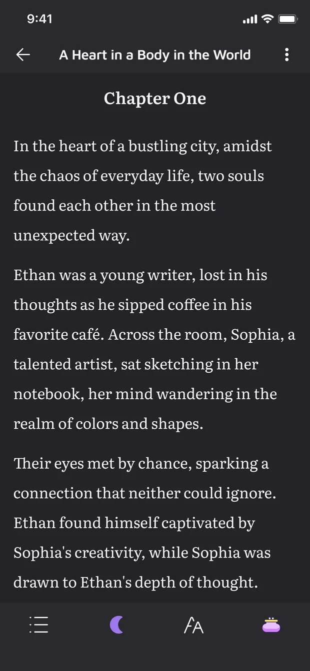
Underneath all of it the reading view is #F3EEE7, not white. Pure white against a dark room is a wall of light, and an hour of it is what makes people put a phone down. The off-white takes the glare off without reading as a tint, and the dark theme is its opposite number rather than an inverted copy.
Empty states
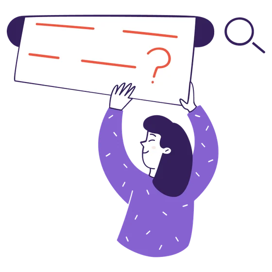
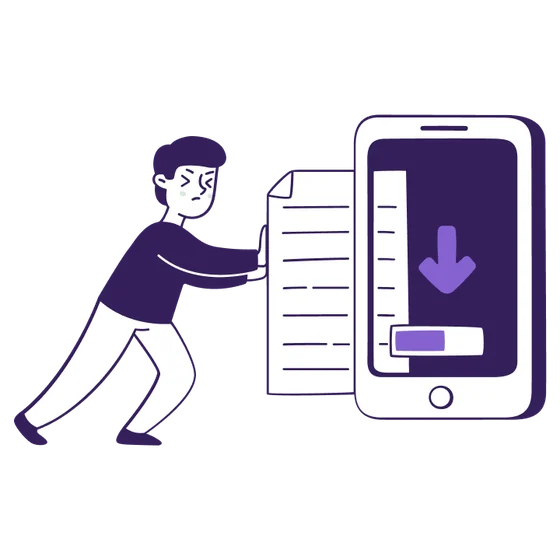
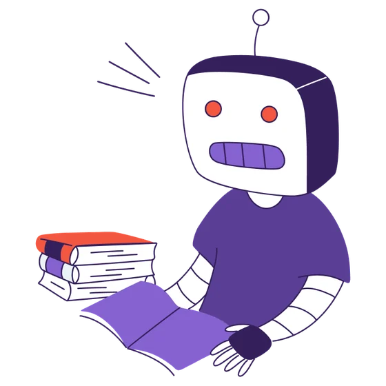
Nine moments where the app has nothing to show. An empty screen is usually where a product starts to feel broken, so each one got its own drawing, its own title and its own way out instead of a shared shrug. They also gave the palette somewhere to live outside the reading view.






Final
Final screens
The interface the groundwork was for.
Discover & search
The home screen and search, where a reader arrives with nothing particular in mind.


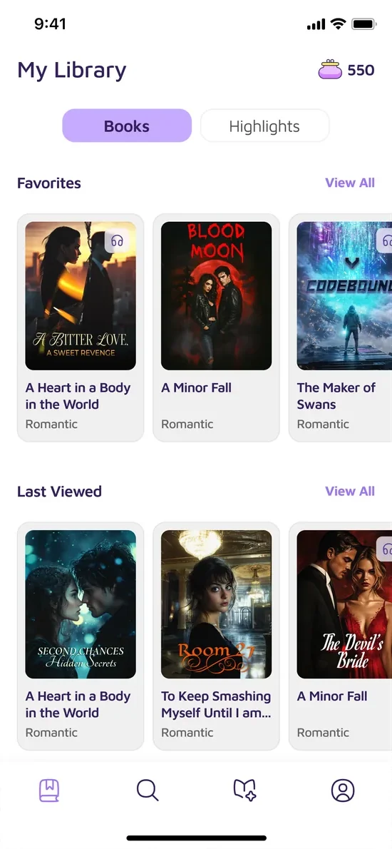
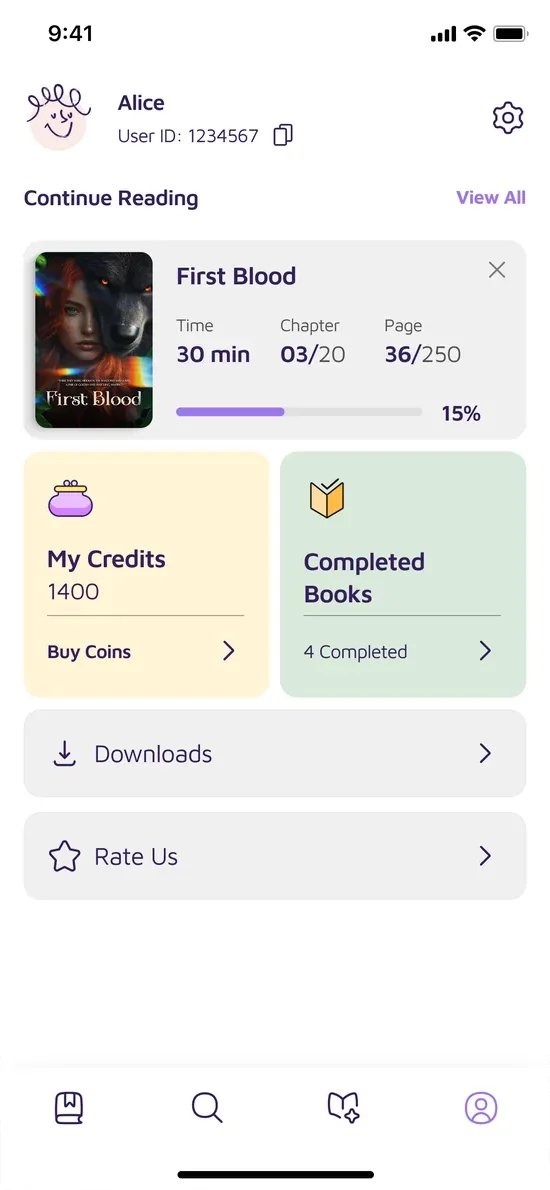
Library & profile
Saved books and highlights, reading progress, credits and completed titles.
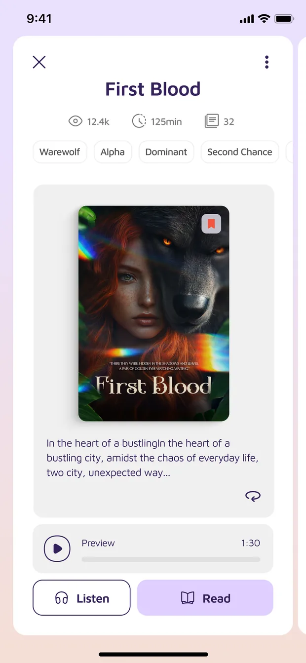
Book detail, listening and credits
Where a title is decided on, heard, and paid for by the chapter.

Reading
The same chapter in both themes. Off-white by day, near-black at night.

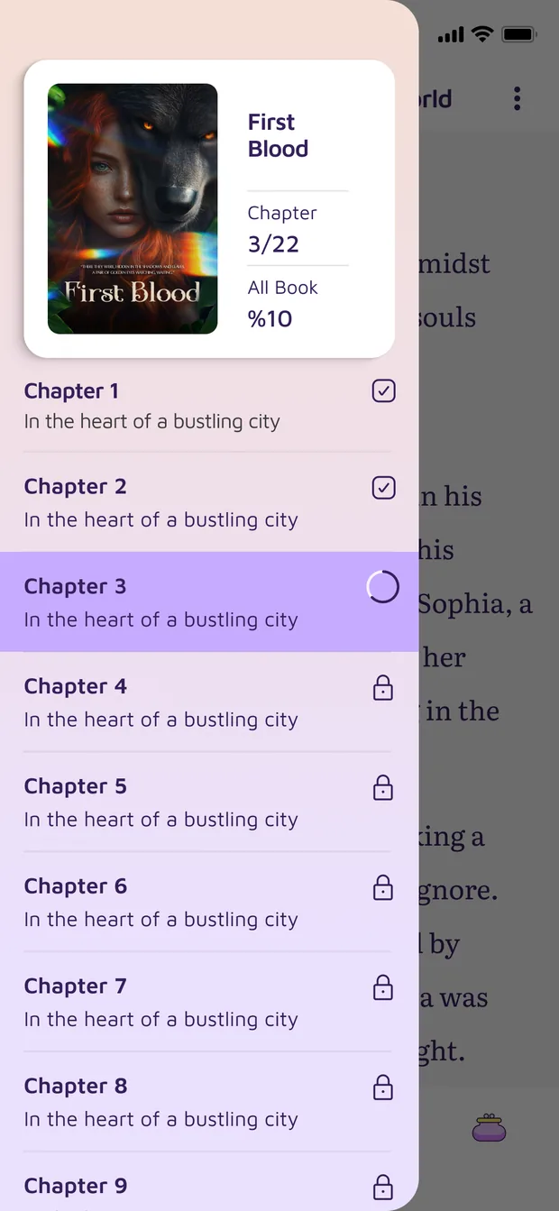
Reading controls
Type size, background, page transition and typeface, plus the chapter list with what is unlocked and what is not.



Novelty is a VLMedia Inc. product. Screens, artwork and brand assets © VLMedia Inc. All rights reserved, shown here as a record of my design work.
All projects